Introduction to Page Builder
Welcome Brand Ambassadors!
We're so thrilled to have you on Beam, the only brand center designed to honor and celebrate the unique qualities of your brand.
We want to get you building pages to house your brand assets as quickly as possible. That's why we've put together this Page Builder template - to introduce you to the many structural elements we've created to help you highlight your brand. We recommend using this page as a way to visualize how Page Builder components will look using your brand styling. You can even duplicate this page to use as a template for your own designs.
Ready to go? We'll start by exploring the different types of sections you can add to your page before moving on to specific Page Builder components.
Know what you need? Use the anchor links to the left to quickly navigate to the content you're looking for.
Sections
Content grid
A content grid is a single-column section that spans the width of the page but leaves a bit of the margin on either side. Content grids can also be made full-width, leaving no margin.
Great for:
- Using with components like hero or gallery
- Making a statement and drawing the user's attention


2-column
A 2-column section splits the content grid into 2 even containers. It can hold different pieces of content in each column and spans the width of the page but leaves a bit of margin on either side. These sections can also be made full-width, leaving no margin.
Great for:
- Creating visual distinction between copy and a piece of media like an image or video
- Adding white space to a design

This is an example of a 2-column section with an image component and some text formatted as a headline.
3-column
A 3-column section splits the content grid into thirds. It can hold 3 different pieces of content in each column and spans the width of the page but leaves a bit of margin on either side. These sections can also be made full-width, leaving no margin.
Great for:
- Creating visual distinction between copy and media like an images or videos
- Adding white space to a design


4-column
A 4-column section splits the content grid into fourths. It can hold 4 different pieces of content in each column and spans the width of the page but leaves a bit of margin on either side. These sections can also be made full-width, leaving no margin.
Great for:
- Creating visual distinction between copy and media like an images or videos
- Adding white space to a design


Basic Components
Once you've added a section to your page, you can start populating it with components of your choice. Our components are split into two types: basic and media. Here, we'll look at how basic components look and function.
Accordions
Accordions allow users to engage with content at their own pace, expanding or collapsing text and images. Accordions can hold all other component types and be presented in 3 sizes: compact, normal, and expanded. Title, subtitle, and divider colors can be personalized. Accordion panels can hold any components but only offer 2 layout options: content grid and 2-columns.
Use:
- To house large amounts of information
- When information is nonessential and can be explored by the user at will
- To create FAQs and Q&As
Tabs
Tabs allow users to progress through text and images in bite-size increments. Tab styling is taken from your brand system but the look of dividers and individual tab items can be personalized. Tabs can hold any components but only offer 2 layout options: content grid and 2-columns.
Button
Buttons create a call-to-action, directing users to other pages or external sites. Buttons can be added to any component and section. Some components - like link card, info card, and heroes - have buttons built in. The styling of buttons is pulled automatically from your brand's system, but you can adjust the size, alignment, and button type (primary or secondary), as well as customize text and click-through destination.
Divider
Dividers are solid lines used to break up content on a page visually and can be placed in any section type. Divider color, thickness, and padding can be customized.
Below is an example of a divider that's 2 pixels thick in a content grid section.
Here's a 4-pixel divider in a 2-column section.
Here's a 6-pixel divider in a 3-column section.
And here's an 8-pixel divider in a 4-column section.
Color block
Color block provides your brand's exact color codes, making them easy to copy and paste. Available colors are pulled directly from your brand system but the block itself offers a number of personalization options, including: adding the color name along with Pantone, RGB, CMYK and HEX codes.
Corner radius, padding, drop shadow, and background color of the block itself are also customizable.
Info card
Info cards highlight content using text and images. They can contain images, a headline, body copy, and buttons which directs the user to a single destination.
There are three layout options for info cards: stacked, overlay, and collage. Within each, there are personalization options, including: orientation of the card against the image, the image position, background color, title, subtitle, appearance, and image options. Images are selected from the Media Manager.
Note: Info cards can only be added to 2-column, 3-column, or 4-column sections.


Link card
Link cards connect users to relevant content. They contain text links to as many as 4 unique destinations.
Unlike info cards, link cards can't contain full images, but they can include a small card graphic. They are styled using your brand's system but can be further personalized by adjusting the styling of the border, title, description, and card graphic.
Note: Info cards can only be added to 2-column, 3-column, or 4-column sections.
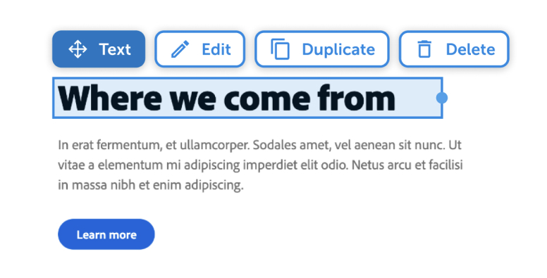
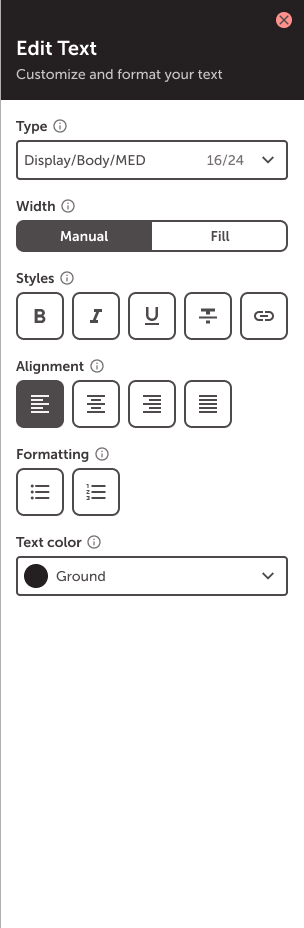
Text
The text component allows you to customize and format text. While text itself is added by typing into text boxes on a page, the text component provides text hierarchy options drawn from your brand's system guidelines, as well as the ability to adjust width, style, alignment, formatting and text color. You can also link text and add a click-through destination. Here’s an example of using the text editor in Page Builder.
Media components
The text component allows you to customize and format text. While text itself is added by typing into text boxes on a page, the text component provides text hierarchy options drawn from your brand's system guidelines, as well as the ability to adjust width, style, alignment, formatting and text color. You can also link text and add a click-through destination. Here’s an example of using the text editor in Page Builder.
Image
Images add visual interest to pages. Drag the image component into any section to upload a new file or select one from the Media Manager. Images can be customized by manually adjusting the focal point, aspect ratio, fill style, and appearance. They can also feature an optional caption or click-through link.
Below is an example of images in a 2-column section.


Video
The video component allows you to upload and showcase videos of related content. Drag the video component into any section to upload a new file or select one from the Media Manager. Once added, videos can be made to show player controls, autoplay the video, play the video in a pop-out window, loop the video, and mute. Note: The below video example is set to "show controls" and "loop video". "Autoplay" is turned off.
MP4 format required.
Videos can be added to tabs and accordions as well.

Gallery
The gallery component showcases multiple images and videos and can be placed in any section type. Gallery contents can be displayed as slides, in a carousel, or in a grid. Depending on the gallery type chosen, there are a number of customization options, including: thumbnail placement, sizing, navigation controls, fill style, and CTA and click-through destination.
This is a great component to display multiple media files without taking up too much space on the page.
Below is an example of a carousel gallery.


Hero
Heroes make a statement with slides. They are often used as page headers or to showcase specific content.
Heroes feature a background image or color with a card overlay and can include a button. Slides within a hero can be reordered and feature different pieces of content or media, uploaded from the Media Manager.
Customization options depend on the layout and media added, but can include navigation controls, title, subtitle, buttons, and video settings.
Note: Heroes can contain a minimum of 1 and maximum of 5 slides.
Make an impact.
Heroes are a great way to showcase unique content.
Type hierarchy
Here's how your brand's style will be applied to type hierarchy within your Beam site.
Display/3XL/700
Display/2XL/700
Display/1XL/700
Display/LRG/700
Display/MED/700
Display/SML/700
Display/1SX/700
Display/2XS/700
Body/LRG/500
Body/MED/500
Body/SML/500
Label/LRG/500
Label/MED/500
Label/SML/500
© 2026 MediaValet. All rights reserved.