Typography
Typography plays a key role in expressing our brand’s personality—modern, intelligent, and approachable. Our type system combines sharp, geometric precision with clean readability, ensuring clarity across all platforms, from websites to product interfaces to presentations.
Primary typeface
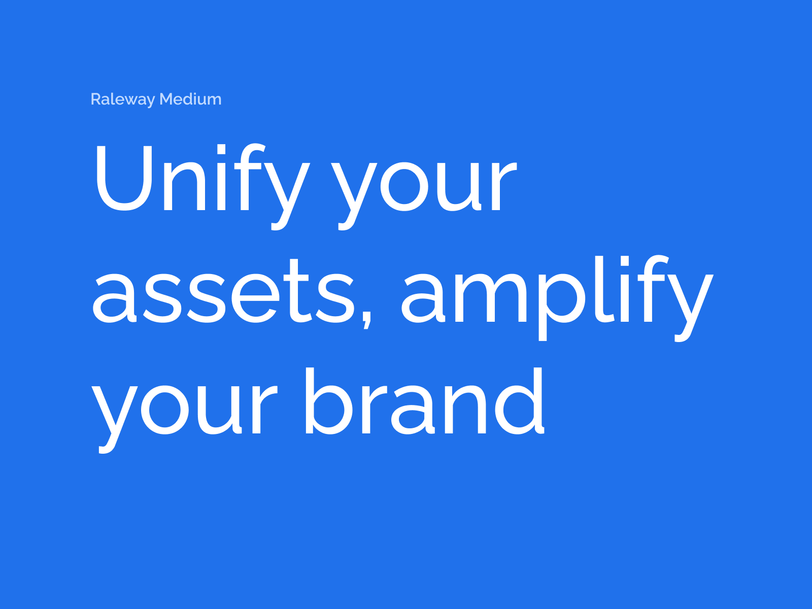
Raleway
Raleway is our primary typeface. Its refined, minimalist design reflects our forward-thinking, design-conscious identity.
Raleway is a modern, elegant sans-serif typeface known for its clean lines, geometric structure, and versatile weight range. Originally designed as a display font, it has evolved into a full family suitable for both headings and body copy, making it an excellent choice for digital-first branding.
Why it works for MediaValet:
Raleway’s blend of modernity and clarity supports the values of innovation, efficiency, and trust. Its sharp aesthetic feels at home in digital environments, from websites and apps to pitch decks and product interfaces. Whether you're conveying complex information or building a bold visual identity, Raleway delivers a future-facing, user-friendly typographic experience.
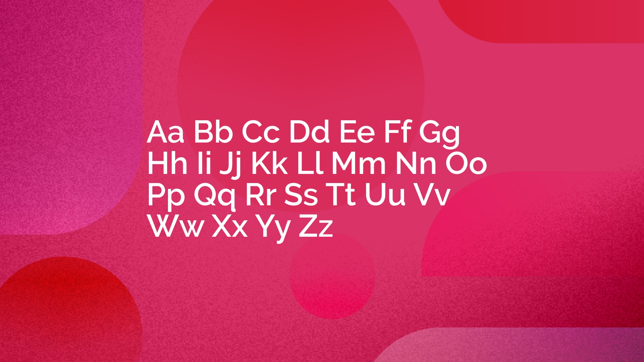
Primary typeface
Raleway
Raleway is our primary typeface. Its refined, minimalist design reflects our forward-thinking, design-conscious identity.
Raleway is a modern, elegant sans-serif typeface known for its clean lines, geometric structure, and versatile weight range. Originally designed as a display font, it has evolved into a full family suitable for both headings and body copy, making it an excellent choice for digital-first branding.
Why it works for MediaValet:
Raleway’s blend of modernity and clarity supports the values of innovation, efficiency, and trust. Its sharp aesthetic feels at home in digital environments, from websites and apps to pitch decks and product interfaces. Whether you're conveying complex information or building a bold visual identity, Raleway delivers a future-facing, user-friendly typographic experience.
Logo Color Variations
If your brand has a good deal of logo versions - such as 1-color, color-reversed, and color-on-color - consider displaying them using a tab component, like this.
Logo Usage
This section is used to help members understand how to correctly apply your logo in a variety of situations. Specifications around wordmarks, logo lockups, clear space, minimum space, and placement are often found here.
A tab component can help organize this type of related information in an easily digestible manner, allowing members to peruse the content at their own pace.
If your brand has a good deal of logo versions - such as 1-color, color-reversed, and color-on-color - consider displaying them using a tab component, like this.
Tabs allow readers to engage with content at their own pace and reduce unnecessary page scrolling.
You can include up to 8 unique tabs. Each tab can hold text, videos, images, and buttons in either a single column or 2-column layout.
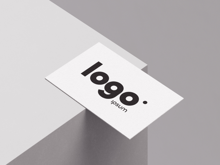
Logo Application
Help your organization get a sense of what correct logo application looks like by showcasing real-world examples of your brand in action.
Here, we use a gallery component to show several pieces of media at once. A gallery can be displayed as slides, a carousel, or a grid. When you add a gallery to a page, you'll be given the option to select images and videos from your Media Manager or upload new media.
Logo Misuse
Sometimes called "Watchouts," a misuse section is a good way to help people understand how not to use your logo. These sections can contain multiple examples of what not to do with your logo.
We used a 3-column section along with image components and text components below each to expand on what went wrong.
DO NOT change the logo’s colors.
DO NOT move any parts of the logo.
DO NOT remove any part of the logo.
DO NOT change the design of the logo.
DO NOT resize a single part of the logo.
DO NOT add design elements to the logo.
© 2026 MediaValet. All rights reserved.